Can your client tell what is happening?
Your client opens their CRM. There are charts everywhere. But can they answer three simple questions: Are leads coming in? Are appointments happening? Is any of it turning into business?
That is the job of a good GoHighLevel client reporting dashboard. It should give someone a useful picture of the business before they click into a single contact or opportunity. If they need you to narrate the entire screen, the dashboard is making them work too hard.
These are seven metrics we would start with. You will see cropped examples from Creative Pop and the flagship Agency Dash Pro Dashboard as we go. Every screenshot uses preview data, and the examples come from different reporting periods. Treat the numbers as illustrations, not a case study or a performance benchmark.
1. New leads or inquiries
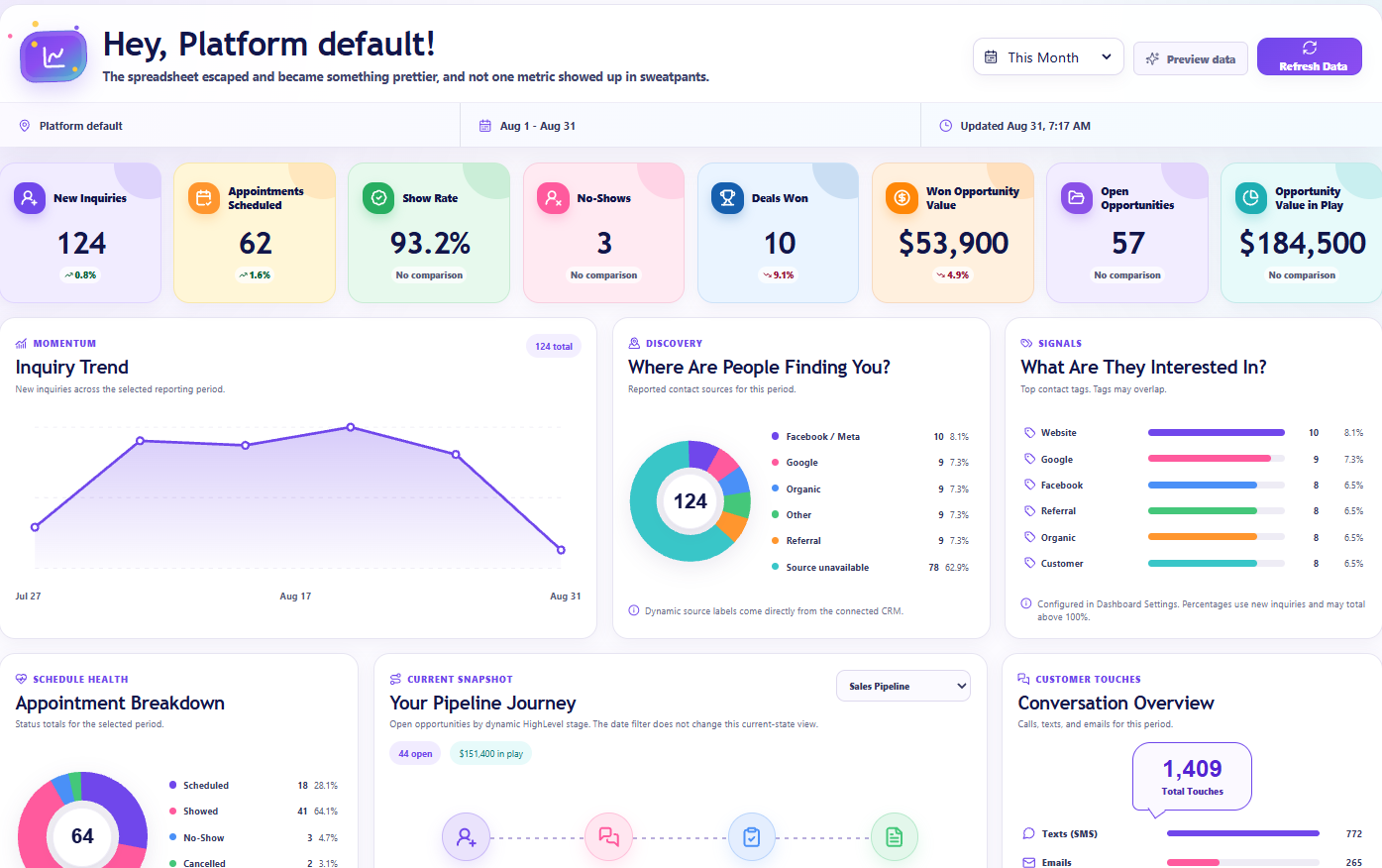
Start with the obvious question: Is anyone coming through the door? New leads or inquiries give you a quick read on how much fresh interest is entering the account during the selected period.
The trend is often more useful than the total. In this Creative Pop example, 124 inquiries tells you the overall volume. The line underneath shows how that volume moved through the period. That is a much better starting point than one lonely number with no context.
If inquiries fall, look at the source breakdown, campaign activity, and whether the forms are still collecting the right information. If inquiries rise but appointments do not, follow-up is the next place to look. Also decide what counts as a new inquiry in your account: an imported contact is not automatically a new prospect.
2. Appointments scheduled
Interest is nice. Getting something on the calendar is a more concrete next step. Appointments scheduled helps answer whether the lead flow is turning into booked conversations.
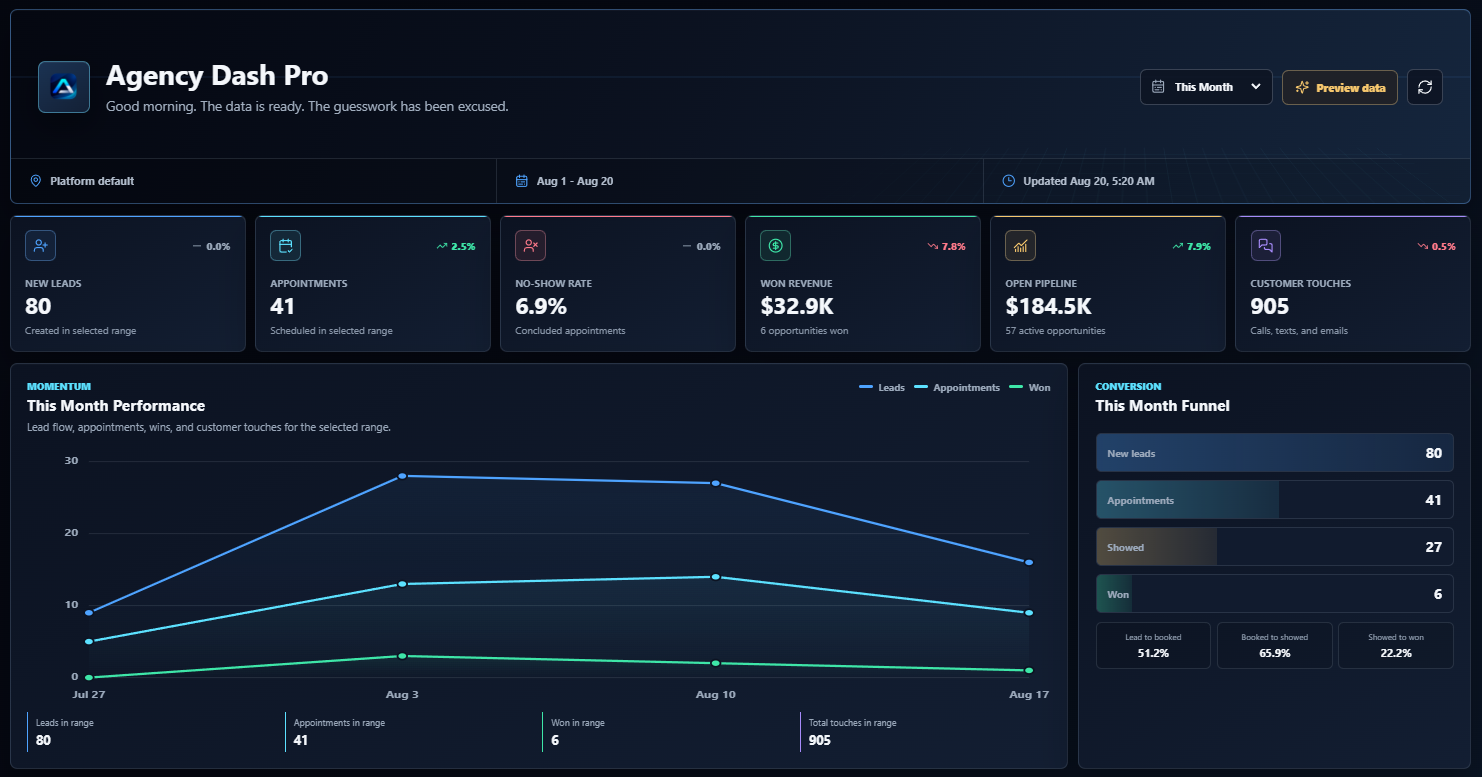
The flagship dashboard makes that number easy to spot. In this example, the appointment card shows 41 scheduled in the selected range. You can use the same conversation to ask which calendars are getting bookings and whether the team has enough capacity to handle them.
Be clear about what the date filter means. An appointment created this week and an appointment taking place this week are different things. Use the dashboard’s reporting definition consistently, and keep upcoming appointments separate from the period total. Otherwise, two people can look at the same calendar and argue about different numbers.
3. Show rate and no-shows
A booked appointment is not the same thing as a conversation that actually happened. This is where show rate and no-shows earn their place on the dashboard.
Creative Pop puts the two side by side, which makes the attendance picture easy to read. The percentage gives you a quick signal. The no-show count gives that signal some scale. Three missed appointments means something different when there were five bookings than when there were fifty.
Before comparing percentages, check which appointment statuses are included in the calculation. Future bookings and cancelled appointments should not be silently treated as no-shows. If attendance slips, check reminder delivery, confirmation steps, booking delays, and whether appointment statuses are being updated. Better reporting starts with records that reflect what actually happened.
4. Deals won
At some point, the client is going to ask the question everyone has been circling around: Did we actually win anything? A deals-won count puts that answer in plain sight.
Creative Pop shows ten wins in this example. It is a straightforward number, and that is the point. A client can understand it without knowing how every pipeline stage is configured.
If bookings are healthy but wins are falling, review the sales conversations and where opportunities stall. Make sure the team marks opportunities as won consistently, too. And remember that a won opportunity is a CRM record: depending on how the account is set up, it may not represent a unique customer or a paid invoice.
5. Won opportunity value
Ten wins sounds good. But ten small projects and ten large contracts tell very different stories. Won opportunity value adds the money context to the win count.
Here, Creative Pop labels the card explicitly as Won Opportunity Value. Some dashboard layouts use wording such as Won Revenue. Either way, explain what the underlying number represents: the value recorded on won opportunities, not automatically cash collected, profit, or verified accounting revenue.
If wins increase while won value drops, the average deal may be smaller. If the value looks wildly high, check whether the opportunity amounts are entered consistently. One extra zero can make a very impressive chart and a very awkward reporting call.
6. Open pipeline value
Wins tell you what has closed. The open pipeline tells you what is still in play. A useful GHL reporting dashboard should make room for both.
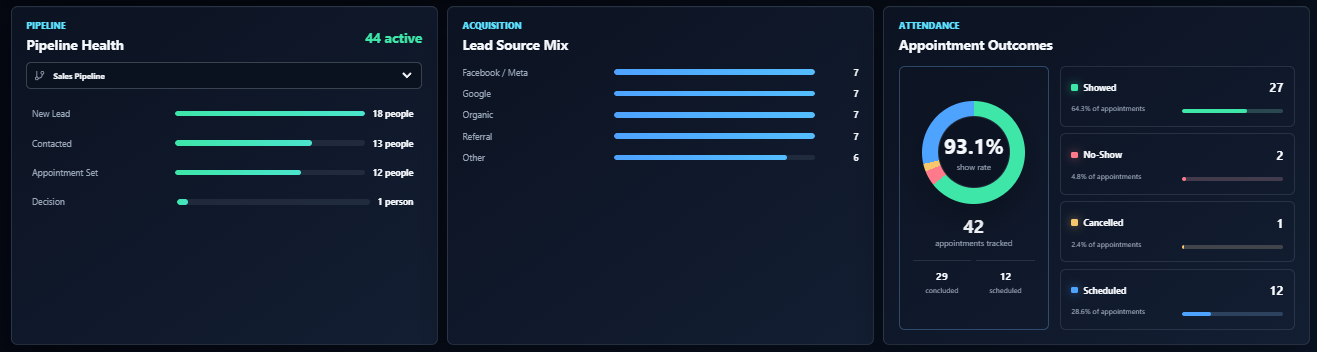
Start with the value attached to open opportunities, then look at how those opportunities are distributed across stages. The Pipeline Health view in the flagship dashboard helps with the second part: are opportunities moving toward a decision, or piling up near the beginning?
Open pipeline value is potential business, not promised income. A big total can hide stale opportunities, missing next steps, or inflated deal values. If the pipeline looks healthy but wins are not following, look at opportunity age and stage movement before celebrating the headline number. This stage view is a current snapshot, so it also deserves a different conversation from a period-based win total.
7. Calls, texts, and email activity
Sometimes the missing piece is very ordinary: nobody followed up. Communication activity gives the client a clearer view of whether conversations are actually happening.
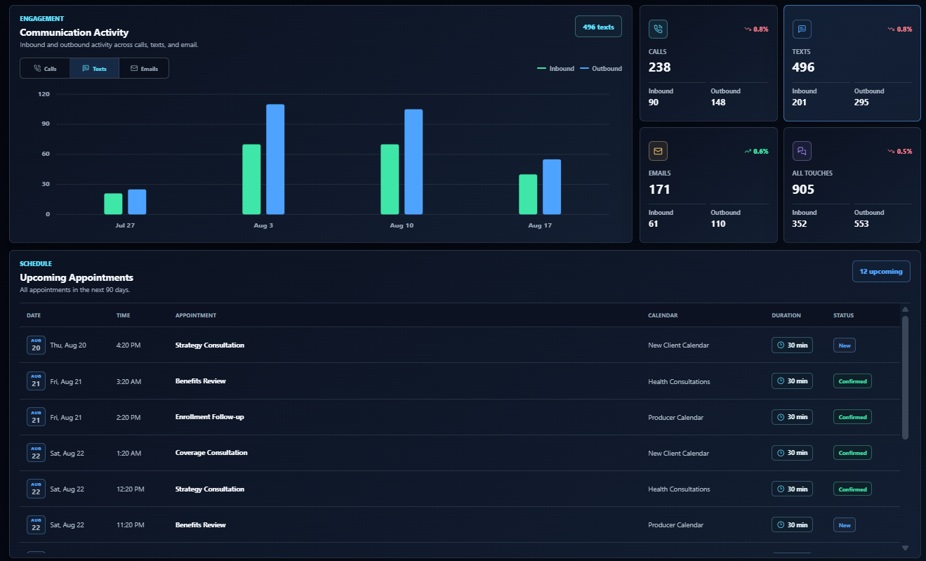
The flagship dashboard breaks customer touches into calls, texts, and emails, with inbound and outbound counts. That is much more useful than a vague claim that the team has been busy. You can see which channels are carrying the activity and whether people are responding.
More touches do not automatically mean better follow-up. Automated messages can increase the totals without moving a single deal forward. Read activity alongside appointments and wins. If outbound volume goes up but responses and bookings do not, review the timing, audience, and message itself. Activity is a clue, not the finish line.
Make the numbers work together
The best client dashboard KPIs are the ones that help someone decide what to do next. Leads rising while bookings stay flat points you toward follow-up. Bookings rising while attendance drops points you toward the appointment experience. Wins rising while won value falls points you toward deal size.
Those patterns give you better questions, not automatic answers. Use a consistent reporting window, check the last updated time, and remember that contacts, appointments, and opportunities are different records. Dividing this month’s wins by this month’s new leads is not necessarily the conversion rate of that exact group of leads.
HighLevel has its own dashboard widgets and reporting options. Agency Dash Pro gives those client reporting conversations a curated presentation: choose the dashboard family that fits the account, connect it, and embed it inside HighLevel. Our setup guide walks through that process.
That is the goal. A client should open the CRM, understand the picture, and know what to ask next. Seven clear metrics that do that are worth a lot more than a wall of charts nobody wants to explain.