The dashboard we kept coming back to
This was one of the first dashboards we built for Agency Dash Pro, and it is still the one that makes people stop for a second when they see it. It does not try to turn the CRM into a spaceship. It just makes the first screen feel complete.
It starts by giving the account a real home base: a clean title area, date range, refresh state, and a reporting view that feels like it was actually made for the person opening it.
The native starting point is a pretty tough sell
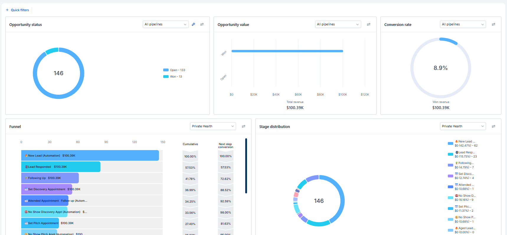
Let’s be real. The standard HighLevel CRM dashboard gets the job done, but it does not make a finished account feel special. It is a generic collection of opportunity status, opportunity value, conversion, funnel, and stage charts that could belong to almost any account.
That is fine if you only need to check a number. But if you have put real work into a CRM build, it is an odd place to leave the client. The first screen should make the account feel alive, not like somebody stopped one step before the handoff.
The numbers people actually look for
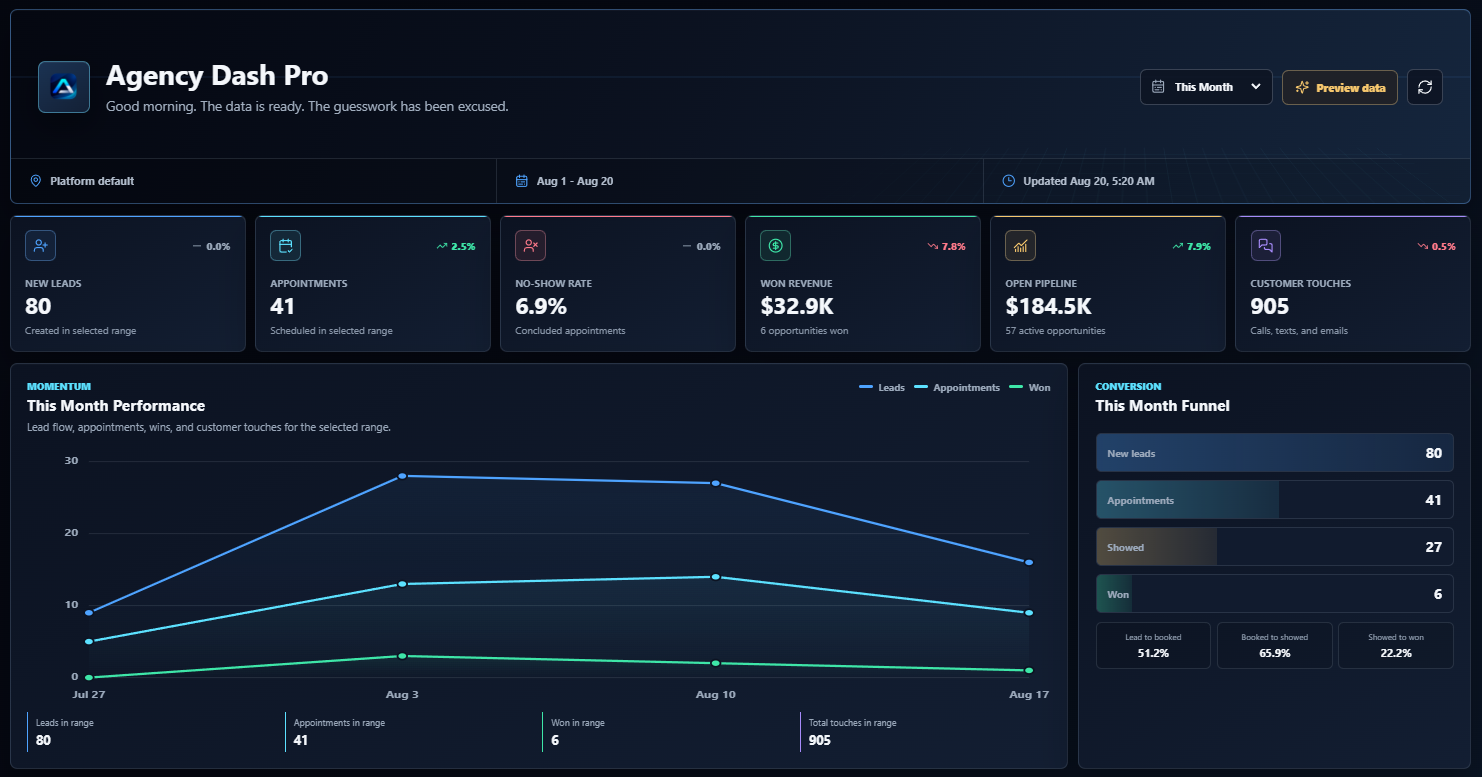
The flagship Agency Dash Pro Dashboard is a custom GoHighLevel dashboard that puts the quick answers right at the top: new leads, appointments, no-show rate, won revenue, open pipeline, and total customer touches. You can glance at it and immediately understand whether the account is moving.
Those cards are not there just to look good. They give people a simple starting point for the questions they are already asking: Are leads coming in? Are appointments happening? Are people showing? What has actually been won? What is still sitting in the pipeline?
It tells the story behind the cards
Then it goes beyond the quick glance. The performance chart lets you see leads, appointments, wins, and customer touches over the selected period. The monthly funnel shows how new leads move to appointments, showed appointments, and wins, along with the conversion percentages between each step.
Instead of seeing one big number and guessing what happened, you can see whether the gap is lead volume, booked appointments, show rate, or closing. That makes reporting conversations a lot less vague.
The day-to-day details are already there
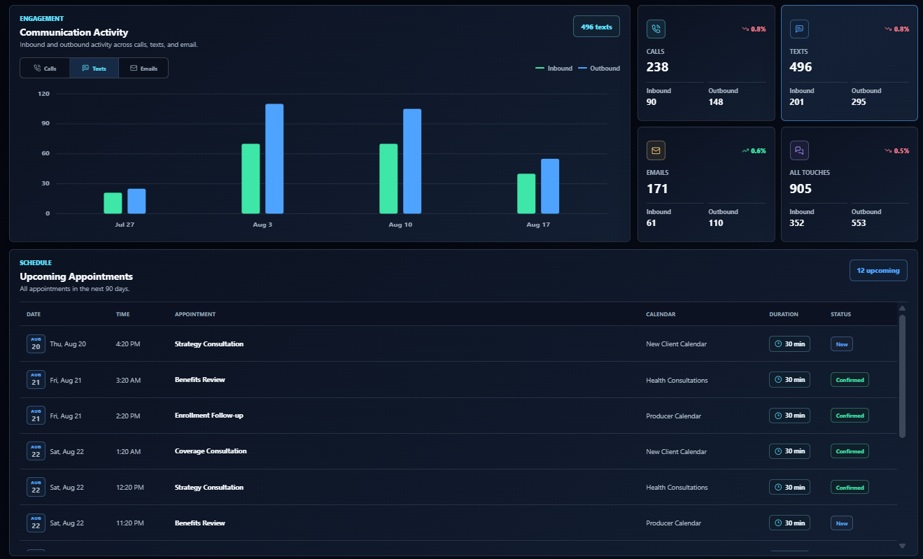
On the communication side, you can break activity into calls, texts, and emails, then see inbound and outbound totals. The upcoming appointments section keeps the next ninety days easy to scan, including the calendar, duration, and current status.
This is the practical stuff people actually use. A client does not have to dig through three different areas of HighLevel just to answer, ‘Did we follow up with these people?’ or ‘What is coming up this week?’
Pipeline health, lead sources, and appointment outcomes
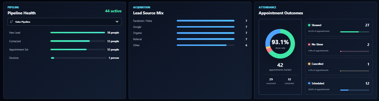
The lower reporting views fill in the rest of the picture. Pipeline Health shows where active opportunities are sitting. Lead Source Mix makes it easier to see where inquiries are coming from. Appointment Outcomes turns show rate into something you can actually talk about, with showed, no-show, cancelled, and scheduled appointments all in one view.
It is a much better conversation than staring at a generic opportunity donut and trying to reverse-engineer what it means.
Make it feel like it belongs to the company
One of the best parts is that the dashboard does not have to stay blue. You can change the colors to fit a company’s brand, so the reporting screen can actually feel like it belongs inside their account instead of looking like a borrowed template.
A branded HighLevel dashboard should feel like it was made for the company using it. That small bit of customization goes a long way. It is the difference between ‘here is a dashboard’ and ‘this is your dashboard.’
Polished, but still practical
This dashboard is polished because it is supposed to be opened. It gives clients a clean way to stay close to leads, appointments, pipeline, revenue, communication, and follow-up without turning reporting into another task.
That is why it remains the flagship. It takes a CRM account that already works and gives it the front door it deserved in the first place.